top of page
Trading Card Bulk Buying
A Simpler Way To Buy Cards
Project Duration: January - December 2021 (Fictitious project)
Tools Used: Figma, Lookback, Miro, Zeplin
.png)
Challenge Overview
Many trading card game players buy multiple cards online. Oftentimes the player has to search for each card individually across multiple websites. Having to buy from multiple sellers results in spending excess time searching for cards and can lead to increased shipping costs. For this project, I focused on how I could simplify the searching and buying process for trading card players so they don't need to search across multiple websites for cards.

Photo by Jonathan Peterson on Unsplash
Research & Analysis
I conducted interviews with five individuals that purchase single trading cards online. I used this research to shape the development of features by determining what opportunities and needs exist for a bulk card buying feature and to better understand the user behavior.
-
The most important factor when determining who to buy cards from is the price the seller is offering vs the market.
-
Cards are bought online because of convenience and ease of access.
-
Cards are bought every few weeks to months.
-
TCGplayer.com is often the first source looked at because it provides the market value cards and they sell below market value.
-
Participants take time to check other websites like Ebay to get the best deal.
Players want a convenient experience and to feel like they are getting a good deal. Having the market value of cards and giving the user the ability to search for multiple cards rather than individual cards will give the user a convenient experience.

Photo by Marten Newhall on Unsplash

Photo by Glenn Carstens-Peters on Unsplash

Notes from interviews organized by themes
Design: Concepts & Sketching
I conceptualized thirteen different features based on my finds of different opportunities for trading card purchasing. I used a four quadrant feature prioritization strategy to estimate the benefit and complexity of each feature to determine three to focus on developing for this project. I chose the following:
-
The ability to create and save "wish lists" which will function as a list of cards the user can save for later review and purchases.
-
Recommends card sellers to buy from based on goals such as cheapest price or minimum packages.
-
Use a "wish list" to search for sellers to buy cards from based on goals specified by the player such as quantity, price, and card conditions.
To create the sketches I did the crazy 8 exercise along with regular sketches. After finishing the exercises I picked and combined different parts of my sketches to develop a low-fidelity clickable prototype in Figma.

Crazy 8 Sketches

Wish List Sketches
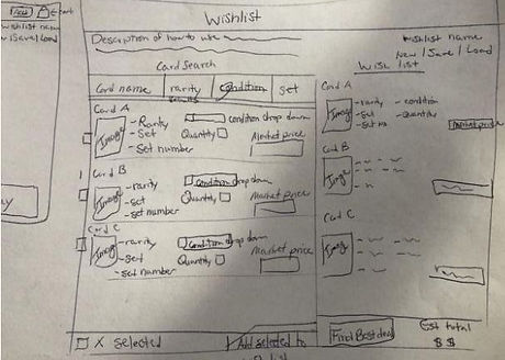
Wish List Sketches

Main Page Sketches

Bulk Buying Sketches
Design: Low-Fidelity Prototyping
The low-fidelity prototype has 4 screens. The home page, the card search page, the seller search page, and the checkout page. The clickable prototype takes you through the process of creating a new wish list, searching for sellers to buy from, and checking out.

-
There was one participant that tested the low-fidelity prototype.
-
The participant was able to complete all tasks except for optimizing their cart to minimize packages.
-
The participant said it wasn’t clear when the optimization option said “minimize sellers”.
-
-
The participant said they wished they could see more cards results from the search results on the wish list builder page.
Design: Low-Fidelity Iteration
Since the participant struggled with optimizing their cart to minimize packages, the text in the white box was changed from “minimum sellers” to “minimum packages”.


On the second screen, the card search results area was expanded while the area for the wish list was decreased to give the user the ability to see more of the cards from their search results.


Develop: High-Fidelity Prototyping
The first version of the high-fidelity prototype had the same four screens as the low-fidelity prototype.
The login and sign-up buttons were removed from the high-fidelity prototype since the user is going through it as someone that has already signed up. This case study is focusing on the user buying cards in bulk, not signing up. If a user is not logged in then they would see the sign-up and login button.

High-Fidelity Test: Validation, Usability, Feedback
-
Five participants were part of this usability test.
-
80% of participants failed to create a new wish list and clicked the “add” button, which adds searched cards to the wish list instead of clicking the “new” button.
-
One participant said the website looked outdated with the color scheme and design.
-
One participant said the website “seemed straight forward”.
-
When the participant would start selecting cards to add to their wish list they would often click the box with the card information rather than the check box.
Design: High-Fidelity Iteration
Since most participants struggled with creating a wish list I focused on improving the wish list creation flow. My solution was to create an additional page before searching for cards. On this page you can create and delete wish lists.

Solution & Impact Overview
-
The poor user flow for creating a wish list caused confusion and frustration. With the addition of the wish list management page, it should alleviate that problem, but more testing is needed to confirm.
-
For the scope of the project, only one improvement was implemented after doing the usability test for the high-fidelity prototype. But there are additional improvements and tests that could be done to improve the user experience.
-
Try additional color schemes on the website to make it more attractive.
-
Instead of using a checkbox to select cards, highlight the card box to let the user know the card has been selected and have feedback on the page letting the user know how many cards have been selected.

UI Revisions
-
The UI was revised to make the prototype look more modern by using design best practices.
-
An 8-pixel grid was used to create consistent spacing between elements.
-
A progress bar was added at the top so users could easily navigate between steps to make editing their wishlist easier.
-
The page where you added cards to the wishlist list was broken out into two pages to stop it from being overcrowded.
.png)
bottom of page